Code
invisible(lapply(c("tidyverse", "janitor", "plotly", "scales", "ggrepel", "patchwork", "RColorBrewer"),
       library, character.only = TRUE))
LandingData <- read.csv("~/Programming/R/Fish Landings/sample_landings_data_raw.txt")MP Rogers
April 16, 2024
This post is another data analysis one, although a the topic has to do with fish. In this post I’ve taken some online data from here for analysis. This data records the landings of a certain fish species over a few year.
We’re going to assume that these records came from a single company, one we’ll call Franks Fisheries and see what we can learn. I also feel obligated to point out this kind of analysis may be useful to more than just Frank. Fisheries regulators, competitors, fisheries biologists may also find this information insightful.
If you want to skip all the boring housekeeping, jump straight down to Visualisation and Analysis.
Here starts all the messy background work I need to do in order to do the actual analysis. I’ll load in my data, which I’ve downloaded from the link above.
Next I take a look at exactly what is in this dataset.
Rows: 7,214
Columns: 8
$ yy     <int> 2003, 2003, 2003, 2003, 2003, 2003, 2003, 2003, 2003, 2003, 200…
$ dat    <chr> "4/30/03", "4/30/03", "4/30/03", "4/30/03", "4/30/03", "4/30/03…
$ trip   <int> 1, 1, 1, 1, 1, 1, 1, 1, 1, 1, 1, 1, 1, 1, 1, 1, 2, 2, 2, 2, 2, …
$ effort <int> 10, 10, 10, 10, 10, 10, 10, 10, 10, 10, 10, 10, 10, 10, 10, 10,…
$ gr     <chr> "Trap", "trap", "Trap", "Trap", "Trap", "Trap", "Trap", "Trap",…
$ sp     <chr> "Caesoi cunning", "Caesio cuning", "Caesio cuning", "Caesio cun…
$ l_cm   <dbl> 36, 29, 34, 36, 34, 28, 30, 27, 33, 35, 40, 28, 29, 29, 26, 34,…
$ w_cm <dbl> 1089.14017, 565.38794, 915.82756, 1089.14017, 915.82756, 508.31… yy dat trip effort
Min. :2003 Length:7214 Min. : 1.0 Min. : 5.000
1st Qu.:2005 Class :character 1st Qu.: 151.0 1st Qu.: 8.000
Median :2012 Mode :character Median : 279.0 Median : 9.000
Mean :2010 Mean : 374.6 Mean : 9.488
3rd Qu.:2014 3rd Qu.: 502.0 3rd Qu.:10.000
Max. :2014 Max. :1670.0 Max. :16.000
NA's :1
gr sp l_cm w_cm
Length:7214 Length:7214 Min. : 2.00 Min. : 0.17
Class :character Class :character 1st Qu.: 23.00 1st Qu.: 279.96
Mode :character Mode :character Median : 25.00 Median : 360.49
Mean : 25.81 Mean : 460.96
3rd Qu.: 27.00 3rd Qu.: 455.24
Max. :2400.00 Max. :55984.47
NA's :1 This is good, we have about 7000 records here of 8 variables. But the names are pretty bad. They certainly aren’t what I want to work with. I’ll need to change that, and do some reformatting in the process.
The cleaning has been done. You could just trust me, but I’ll show you now anyways.
Rows: 7,214
Columns: 7
$ date      <date> 2003-04-30, 2003-04-30, 2003-04-30, 2003-04-30, 2003-04-30,…
$ trip_id   <int> 1, 1, 1, 1, 1, 1, 1, 1, 1, 1, 1, 1, 1, 1, 1, 1, 2, 2, 2, 2, …
$ effort    <int> 10, 10, 10, 10, 10, 10, 10, 10, 10, 10, 10, 10, 10, 10, 10, …
$ gear_type <fct> TRAP, TRAP, TRAP, TRAP, TRAP, TRAP, TRAP, TRAP, TRAP, TRAP, …
$ species   <fct> Caesoi cunning, Caesio cuning, Caesio cuning, Caesio cuning,…
$ length_cm <dbl> 36, 29, 34, 36, 34, 28, 30, 27, 33, 35, 40, 28, 29, 29, 26, …
$ weight_g <dbl> 1089.14017, 565.38794, 915.82756, 1089.14017, 915.82756, 508… date trip_id effort gear_type
Min. :2003-04-30 Min. : 1.0 Min. : 5.000 : 1
1st Qu.:2005-05-04 1st Qu.: 151.0 1st Qu.: 8.000 GILLNET : 42
Median :2012-07-09 Median : 279.0 Median : 9.000 HANDLINE:1653
Mean :2010-07-01 Mean : 374.6 Mean : 9.488 MUROAMI :1547
3rd Qu.:2014-01-15 3rd Qu.: 502.0 3rd Qu.:10.000 SPEARGUN:2598
Max. :2014-12-16 Max. :1670.0 Max. :16.000 TRAP :1335
NA's :1 TROLLING: 38
species length_cm weight_g
Caesio cuning :7212 Min. : 2.00 Min. : 0.17
Caesoi cunning: 2 1st Qu.: 23.00 1st Qu.: 279.96
Median : 25.00 Median : 360.49
Mean : 25.81 Mean : 460.96
3rd Qu.: 27.00 3rd Qu.: 455.24
Max. :2400.00 Max. :55984.47
NA's :1 Now to fix some of the issues. I see there’s technically two species of fish here. Considering how close the spelling is and that there are only two examples, I’m willing to bet its a typo. Let us clean it up so it wont interfere down the line.
      date               trip_id           effort          gear_type
 Min.   :2003-04-30   Min.   :   1.0   Min.   : 5.000           :   0
 1st Qu.:2005-05-04   1st Qu.: 151.0   1st Qu.: 8.000   GILLNET :  42
 Median :2012-07-09   Median : 279.5   Median : 9.000   HANDLINE:1653
 Mean   :2010-07-01   Mean   : 374.6   Mean   : 9.488   MUROAMI :1547
 3rd Qu.:2014-01-15   3rd Qu.: 502.0   3rd Qu.:10.000   SPEARGUN:2598
 Max.   :2014-12-16   Max.   :1670.0   Max.   :16.000   TRAP    :1334
                                                        TROLLING:  38
          species       length_cm          weight_g
 Caesio cuning:7212   Min.   :   2.00   Min.   :    0.17
                      1st Qu.:  23.00   1st Qu.:  279.96
                      Median :  25.00   Median :  360.49
                      Mean   :  25.81   Mean   :  461.00
                      3rd Qu.:  27.00   3rd Qu.:  455.24
                      Max.   :2400.00   Max.   :55984.47
Lastly, I want to make one slight change. This one is based on domain knowledge. I did some quick conversion of the catches into kilograms, and calculated “Catch per unit effort”, a measure used to standardize catch across gear types.
And that’s it. Now let’s get into the bit that’s exciting.
Let’s take a look then. Firstly, I will look at how much Frank’s Fisheries caught each year. Then I get to begin turning data into a story.
total.landings<- LandingData |>
  group_by(year = floor_date(date, "year")) |>
  summarise(total_catch = sum(weight_kg)) |>
  ggplot(aes(x = year, y = total_catch)) +
  geom_col(fill = "#248a9c")+
  #geom_point(size = 1.8, alpha = 0.8, colour = "#248a9c")+
  #geom_line(colour = "#248a9c")+
  labs(title = "Frank's Fisheries Shows Record Breaking Catches in 2014",
       x = "Year", y = "Total Catch(kg)",
       caption = "After a decline and 3 years downtime ending in 2009, landings have grown to an all time high in 2014")+
  theme(plot.title = element_text(hjust = 0.5))
#total.landings<-ggplotly(total.landings)
total.landings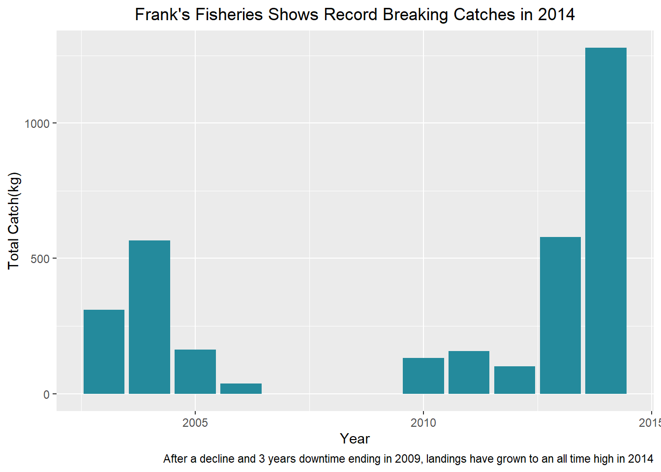
You can see the catch decline after 2004 before falling to nothing for 3 years. However catches resumed in 2010 and rose to an all time high netting over 1250kg. This was a massive increase, more than twice the previous best year.
Who doesn’t like a good comeback story?
That does however raise the question, what fueled this massive jump. Did Frank do more trips(maybe by buying new boats?) or more efficient trips( perhaps with better gear or better fishing spots?
trips_per_year <- LandingData |>
  group_by(year = floor_date(date, "year"), trip_id) |>
  summarise(num_trips = n()) |>
  ggplot(aes(x = year, y = num_trips))+
  geom_col(fill = "#248a9c")+
  labs(title = "More Trips, But Not Enough to Explain Record Year",
       subtitle = "Growth in trips partially explains 2014's record performance",
       x = "Year", y = "Number of fishing Trips")+
  theme(plot.title = element_text(hjust = 0.5))
trips_per_year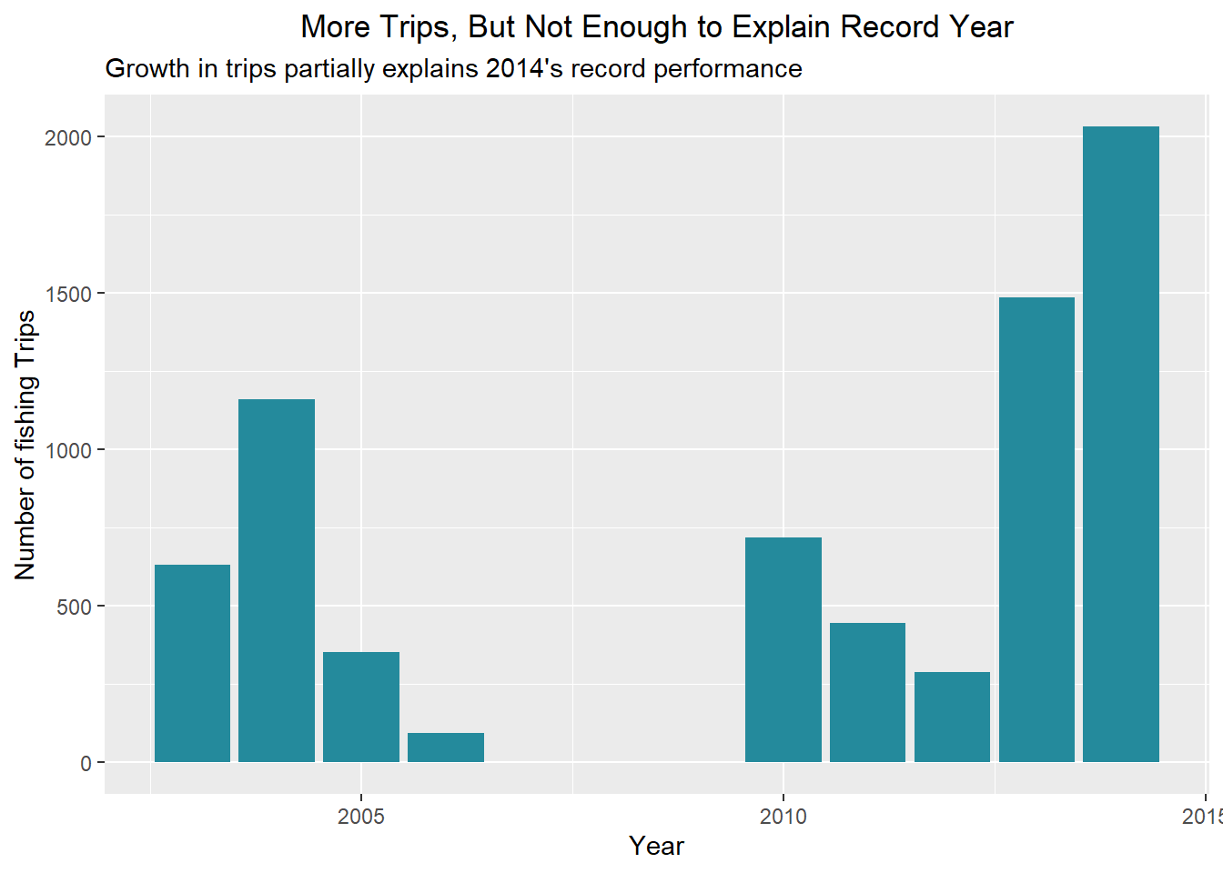
We can see that there was some real growth in trips, but not enough to fuel that massive jump in catch. So I’ll test the second theory, that the trips themselves got more efficient.
Trip.Efficiency <- LandingData |>
  group_by(year = floor_date(date, "year"), trip_id) |>
  summarise(total.catch = sum(weight_kg, na.rm = TRUE)) |>
  group_by(year) |>
  summarise(annual.mean.catch = mean(total.catch, na.rm = TRUE)) |>
  ggplot(aes(x = year, y = annual.mean.catch))+
  geom_col(fill = "#248a9c") +
  labs(title = "Frank's Fisheries has Rapidly Improved Efficiency since restarting in 2010",
       x = "Year", y = "Average catch per Trip (kg)",
       subtitle = "Improvements in efficiency produced record catches in 2014")+
  theme(plot.title = element_text(hjust = 0.5))
Trip.Efficiency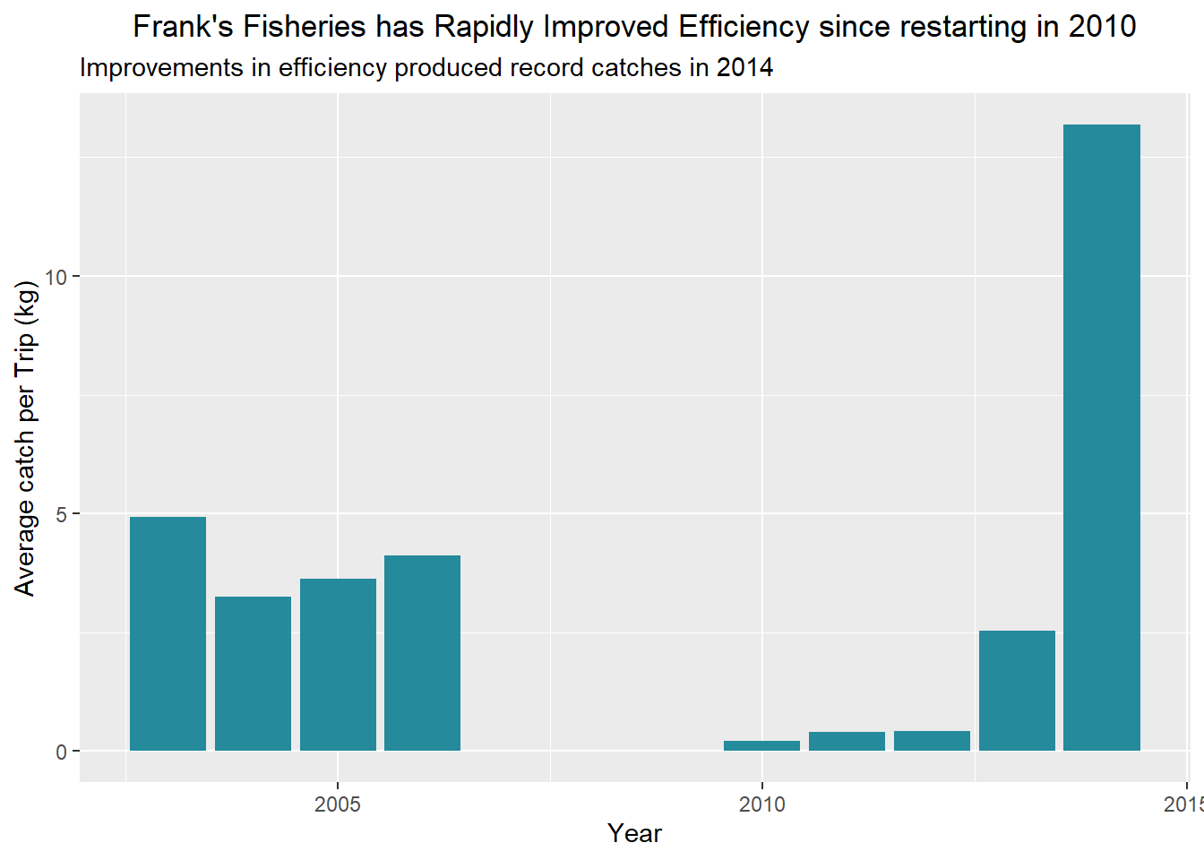
There we go. There’s a massive jump in efficiency especially, culminating in that rock-star year of 2014. It is a combination of more trips and that efficiency responsible for the amazing performance of 2014.
There’s a couple things that could have contributed to that efficiency; better tools, better staff, better fishing grounds. Some of this we don’t have the information to investiagte, but we can absolutely look into which equipment is the most efficient. That catch per unit effort we use to standardise effort between equipment is a great metric to look at.
gear.comparison <- LandingData |>
  group_by(gear_type) |>
  summarise(avg_catch = mean(CPUE)) |>
  ggplot(aes(x = reorder(gear_type, avg_catch),
             y = avg_catch, colour = gear_type))+
  geom_point(size = 5,
             stroke = 2,
             shape = 21,
             aes(colour = gear_type))+
  geom_segment(aes(x = gear_type, xend = gear_type,
                   y = 0, yend = avg_catch))+
  labs(title = "Gillnets and Spearfishing are the Most Efficient Gear",
       x = "Gear Types", y = "Average Catch per Unit Effort")+
  theme(plot.title = element_text(hjust = 0.5),
        legend.position = "none")+
  coord_flip()
gear.comparison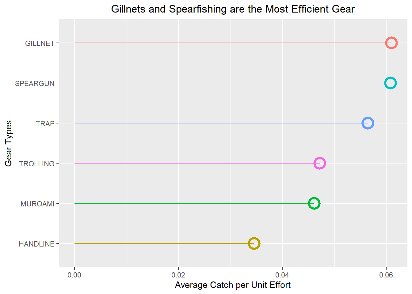
The Gillnet and speargun are the most efficient fishing gear used by Frank’s Fisheries. But that does not tell us their actual catch. We can see the total amount caught with each method.
total.catch.per.method<- LandingData |>
  group_by(gear_type) |>
  summarise(total.catch = sum(weight_kg, na.rm = TRUE)) |>
  ggplot(aes(x = reorder(gear_type,  total.catch),
             y = total.catch, colour = gear_type))+
 # geom_col()+
  geom_point(size = 5,
             stroke = 2,
             shape = 21,
             aes(colour = gear_type))+
  geom_segment(aes(x = gear_type, xend = gear_type,
                   y = 0, yend = total.catch))+
  labs(title = "Spearfishing brought in the majority of fish caught",
       x = "Gear Type", y = "Total Catch (kg)")+
    coord_flip()+
  theme(plot.title = element_text(hjust = 0.5),
        legend.position = "none")
total.catch.per.method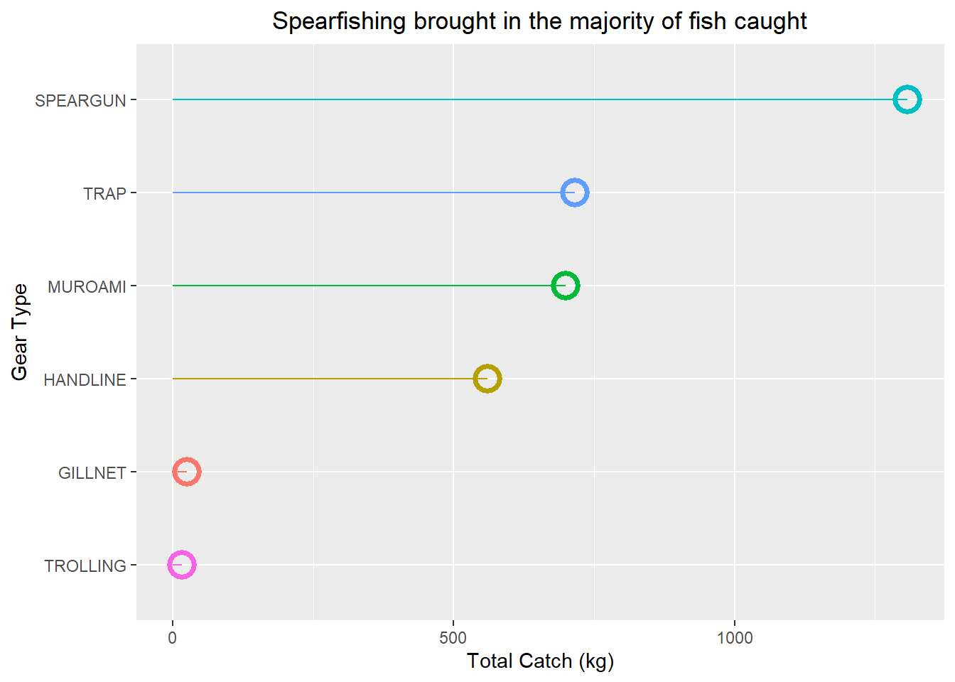
The speargun was the gear with the highest actual catch. This is not super surprising considering we know its one of the most efficient fishing gear. What is more surprising is that the gillnet had such a low catch.
Let’s check on a reason why.
gear.usage<- LandingData |>
  group_by(gear_type) |>
  summarise(num.uses = n()) |>
  ggplot(aes(x = reorder(gear_type,num.uses), y = num.uses,
             colour = gear_type))+
  geom_point(size = 5,
             stroke = 2,
             shape = 21,
             aes(colour = gear_type))+
  geom_segment(aes(x = gear_type, xend = gear_type,
                   y = 0, yend = num.uses))+
  coord_flip()+
  labs(title = "Spearfishing proved the most popular method of fishing",
       x = "Type of Gear used", y = "Number of Uses")+
  theme(plot.title = element_text(hjust = 0.5))
gear.usage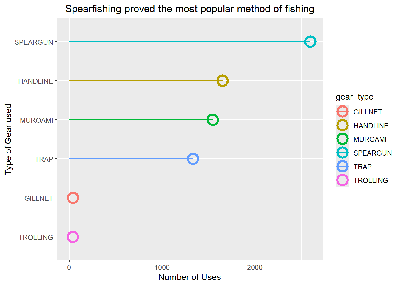
Finally, let’s see how much the gear was used each year.
gear.used<-LandingData |>
  group_by(year = floor_date(date, "year"), gear_type) |>
  summarise(c = n()) |>
  ggplot(aes(x = year, y = c, fill = gear_type))+
  geom_col()+
  labs(title = "Change in Gear Usage over the Years",
       x = "Year", y = "Number of uses", fill = "Gear Type")+
  theme(plot.title = element_text(hjust = 0.5))
gear.used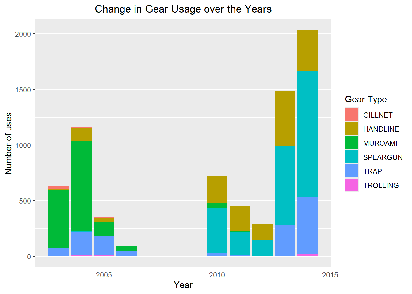
And now we can see, while there was no spearfishing before the shut down, it was a popular fishing method after, and by using the most efficient fishing method, and increasing the number of trips, Frank’s Fisheries had a record breaking year in 2014.
All in all, I enjoyed this little analysis. We went into the data, and managed to extract an actual story and gain some understanding from what was otherwise just a couple thousand rows of letters and numbers.
This information could be useful to present to the owners of Frank’s Fisheries to explain their success in 2014. It could be important for competitors who want to keep up. It could be important for fisheries regulators who want to understand 2014 and see if it’s sustainable.
There’s a lot of practical use in uncovering what the data was saying in a situation like this. I’d love to take on another dataset like this and see what I find next time. Until then.
Walk Good.